


This is a follow up to my previous posts, Risk Dynamics and What Is Risk, on the topic of risk and return, and how we should view “risk” as a living, breathing abstraction in the world of finance. My first writing on the subject was a crude attempt, or thought experiment, on the topic. Here, I’ll try to flesh out the idea a little more. I anticipate this taking a couple more iterations before I really get a handle on both refining my philosophy and being able to effectively communicate it.
Figure 1 shows Howard Marks’ view on the relationship between risk and return: that taking more risk gives investors exposure to higher returns. The y-intercept being the risk-free rate of return. A lot of my thoughts use this concept as a jumping off point, and I’ll attempt to extrapolate off of a lot of Mr. Marks’ ideas. For more reading on the topic, especially from someone far more qualified to talk on the subject than I, I recommend you to go read Howard’s Memos: “Risk Revisited” and “Fewer Losers, or More Winners”.
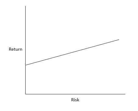
Marks states that return and risk are correlated. If I had one gripe with his methodology, it would be that I don’t think that return and risk are simply correlated, but are instead one in the same. If Physics 101 homework problems are based on a frictionless world, then the Finance 101 corollary would be that for every unit of risk you take, you should expect to be compensated one unit of return. As such, in a perfect world, the line in Figure 1 should have a slope of 1. Simply put, when an asset is 100 bp “riskier” than another asset, then you should expect 100 bp in excess returns. Risk in this sense has nothing to do with volatility. We have to forget everything we’ve come to understand about this notion of “risk = volatility” if we want to expand our philosophy on the subject of risk.
That’s not to say the rest of his philosophy on the subject is invalid. Quite the contrary. But I think a minor tweak that I will make, one that will hopefully make more sense later in this letter, is changing “Return” to “Perceived Risk”. It’s the markets perception of risk (or investor sentiment) that actually prices assets. In theory, Perceived Risk and Expected Return should be indistinguishable. In the real world, return can often be independent of the absolute value of risk, but correlated to it’s [risk’s] movement (explored later). Figure 2 shows the updated chart.

Note that Perceived Risk is shown in excess of the risk free rate (which is where the the curve intercepts the y-axis).
When Risk Changes
One way that value investors get tripped up is by confusing risk as static. There are countless periods in history where markets have actually gotten riskier: Covid & GFC are two of the most recent extreme examples. During both of these, the risk to future cashflows exploded, taking massive government intervention to bring the economy and markets back from the brink.

In the example shown in Figure 3, both the actual risk increased and the market sentiment appropriately reflected the change to risk in the market. In doing so, future returns should be commensurate with the higher levels of risk taken. But, with the risk level changing, the market needs to reprice the asset in question. If this were a Finance 201 practice problem, it might read something like “Given a YTM of x% and a duration of y, what will the NPV of the asset be if the YTM increases?” Knowing that equities are very high duration assets, it intuitively makes sense that a small change in risk (or cost of equity / yield to maturity) will lead to a large change in price. And a large change in risk can lead to a massive change in price. This explains the mid double digit declines during the GFC and Covid.
Moving along the risk curve has large impacts on short term returns; often dwarfing the cost of equity (or YTM) of the asset in question.
Note that in times of great distress, such as GFC or Covid, you may choose to bet on market risk profiles returning to normal, travelling back down the risk curve. If risk levels fall after times of distress, and the market appropriately marks it, then the same mechanism that led to markets crashing can work in reverse to boost forward returns.
This, of course, is in a perfect world. The market, being a voting machine in the short term, can often do a poor job pricing risk. We’ll look at what happens when sentiment doesn’t match reality in the next section.
When Sentiment and Reality Deviate
Let’s consider the real world. There are often times when something is risky, but is perceived as safe (or vice versa). Figure 4 shows what our risk curve looks like when an asset is mispriced.

When the perceived risk is greater than the actual risk level for an asset, we should expect higher returns than if the asset were fairly valued. For stocks, you can think of perceived risk as the market assessment for cost of equity. A higher cost of equity means higher expected returns.
Where things get interesting is when you can find undervalued assets (as defined by an overestimate of risk) shortly before price discovery brings the return profile back in line with the actual risk of the asset. See Figure 5.

For equities, this represents a falling cost of equity that is used to price the stock. And just like the example displayed in Figure 3, the change in risk results in price-action that can dwarf the original expected return from the perceived risk level, alone. This price-action will be explored later.
One very interesting observation that I’ve been having lately is that there are some pre-revenue companies that have been actively hitting milestones, which should act as catalysts for risk reduction, but their prices haven’t been adjusting to reflect it (see Figure 6). In cases such as these, the perceived risk that prices the market may be overstating the actual risk. The hope is to invest in companies as the sentiment risk exceeds the actual risk level, and that the market will eventually reprice the asset to fair value (as shown in Figure 5).

Repricing Effects on Returns
Earlier in this post, we’ve alluded to how changes in risk can lead to returns that differ from the original expected returns (or cost of equity). The easiest introduction to this effect is with bond pricing. Intuitively, an investor wouldn’t pay $100 for a bond that has a $5 coupon when someone else is selling a very similar bond for $100 that pays a $6 coupon. An example of bond pricing is shown in Figure 7. The shape of this curve depends on time to maturity, coupon rate, and yield to maturity.

Bond yields fluctuate all the time, and for many reasons. The credit quality of a business (or business sector as a whole) can improve or decline. The risk free rate might change, pushing up or down yields across the entire yield curve.
For equities, instead of looking at price vs cost of equity (for now), I wanted to look at returns for periods of different timespans. We already know that a sudden risk introduced to the market (ie pandemic) can vastly change the price, just as shown for bonds in Figure 7.
Figure 8 shows the annualized returns for risk changes over two different periods: 2 years in the case that something dramatic happens quickly to a business or overall markets, and 10 years for more gradual changes to risk.

There are quite a few observations we can make based on this graph. The first, annualized returns will equal the cost of equity in the event that the cost of equity doesn’t change (y-intercept). This is roughly true even in the event that risk levels round-trip: i.e., cost of equity starts at 10%, rises to 12%, then fall back to 10%.
The elephant in the room is that changes to risk that happens over a short period of time (orange line) have a massive impact on annualized returns while more gradual changes (blue line) will have more muted ramifications.
Another interesting thing to note is that over a ten year period, returns should almost always be expected to be positive. Risk reduction (moving left on the graph) results in a tailwind for returns, boosting returns above the starting cost of equity. When risk increases (moving right on the graph) results in a headwind for returns, dragging returns below the original cost of equity.
To the contrary, changes in cost of equity will be the primary driver of returns over the short term.
Note that Figure 8 is formulated from a single company (or market) profile. Timing of cash flows, cash flow growth, and starting risk parameters will have large affects on the shapes of these plots.
Volatility
I’ve initially explored this concept in my recent post What Is Risk. In a relatively efficient market, market participants are constantly in search of fair value. But since risk is a moving target, even the best assessments for uncertainty are going to be difficult to nail down. I like to think of risk at any given moment, not as a pinpoint like I’ve drawn in many of the images above, but as relatively wide range as shown in Figure 9. This is because risk, both actual and perceived, are unknowable to any high degree of accuracy. So as market participants react to news and general goings-ons, their assessment for risk will move along with it.

Similar to Figure 8, where we plotted bond prices as a function of YTM (or risk of the bond), we can do the same for stocks (using cost of equity as the definition of risk). It should come as no surprise that risk oscillations, even minute (tiny) changes, can have pronounced daily or weekly effects. Figure 10 shows an example of how changing of risk drives pricing, and how it can translate to short term price movements.

In this sense, risk is not volatility. But rather, volatility is the result of changes to risk. There may be a way to calculate risk from a measure of volatility, but I haven’t explored that yet (it sure would be funny if we ended back at the standard CAPM method).
Market Cycles
Risk will generally traverse from very risky to less risky (and vice versa) over the course of the cycle. This movement down the risk curve as things get / feel safer through time, adds a tailwind to returns, often boosting returns beyond what might be estimated as the initial cost of equity at the beginning of the cycle. Conversely, moving up the risk curve adds a headwind to returns.
How quickly this process takes determines the severity of the price movements. We’ve seen during much of history that the move down the risk curve occurs very slowly, while the move back up the risk curve happens very suddenly, usually as a result of a shock to the economy (GFC, Covid).

This also confirms the mantra that investors should get most aggressive when things “feel” the riskiest, and should become more defensive when things “feel” the safest.