

Fixing CAPE: Does Liquidity Matter?
Valuations. Where did we go wrong?

To many value investors, today’s market just doesn’t seem to make much sense. And it hasn’t for a while. Valuation metrics - the CAPE ratio being one of the most common - have been elevated for years now.
Naturally, our first inclination is to say “no, it’s the Market who is wrong”, clutch our pearls, and continue building cash positions. But occasionally, we should look inward. How might we be wrong? Does the market actually make sense, and it’s us that has things backwards? And at some point, we probably need to actually look for those reasons. Otherwise we’re just old men yelling at the sky.

So every once in a while, I like to question the metrics that we use.
Today, I’m looking at the CAPE ratio again. If you’ve been following me for a bit, you may remember my article covering Policy Impacts to the CAPE Ratio where I looked at how changing things like the corporate tax rate might affect how me measure the CAPE ratio, and how we should adjust our expectations based on those changes. I also looked at potential tariff impacts. This note will be tangential, but largely unrelated to that post.
CAPE: Breaking Down the Components
CAPE is a relatively simple idea. It aims to smooth the natural lumpiness of earnings by averaging the earnings across a full cycle (or close to it) - CAPE, in particular, averages the previous 10 years. It doesn’t use a simple average of nominal earnings, but makes an adjustment to historical earnings by scaling them up by inflation. In theory, this normalizes historic earnings to the pricing power of today.
CAPE Breakdown:
Today’s price
Average of 10-years of trailing earnings
Earnings are inflation adjusted
There’s obviously not really a ton of things to inspect, here, but one that has caught my eye lately is the inflation adjustment.
What if We Adjust By Liquidity Instead?
On the surface, inflation seems like a perfectly fine adjustment to make in the absence of a better alternative. We certainly don’t want to use nominal earnings because they wouldn’t do a good job of normalizing through time.
But there’s nothing inherently correct about using inflation adjusted earnings either. Intuitively, I can think of several scenarios where earnings can go up by a lot for structural reasons while inflation remains low (and vice versa). Here are just a few:
Lowering corporate income taxes
Globalization leads to lower prices and higher margins
Post GFC, we saw plenty of earnings growth in the face of stagnant inflation…reason: unknown
We obviously can’t expect to capture every possible nuance in a simple measure like CAPE.
Today, I ask the question if total liquidity might actually be a better proxy. Using some measure of liquidity answers the question of just “how much” money is available for companies to hoover up. Thinking anecdotally, if I were to give Joe Six-Pack twice as much money as he had yesterday, he’s likely to spend that difference (or at least some proportion of it), which will show up in a tangible way on corporate bottom lines…This is true whether a case of beer goes up in price or not.
Figure 1 shows the comparisons for how nominal earnings behave relative to the growth in inflation (left) and money supply (right). M2 Money Supply will be my proxy for liquidity.
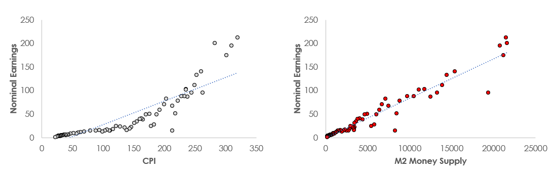
We see that there’s a much tighter relationship between available liquidity and corporate earnings. When money supply doubles, corporate earnings have typically doubled as well.
The reason it may make sense to adjust earnings by liquidity is to ask the question “What would earnings look like in 2016 if the economic system had the same amount of liquidity that currently exists in 2026?” If you we can reasonably assume that earnings would have been higher in an amount proportional to the change in liquidity, then it makes sense to scale those historic earnings by that change in liquidity.
Liquidity Adjusted CAPE
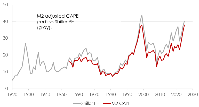
Making this adjustment, we end up with an M2 adjusted CAPE ratio.
Observations
Through a lot of history, the M2 adjustment doesn’t offer a material change from the legacy Shiller Calculation. That makes sense because CPI and M2 should be closely related through time. It’s really only in times of extreme fiscal and monetary action that these should diverge from each other.
Because of the jump in money in 2020, it does make sense to me that 2021 may not have actually been as expensive as we originally thought. With a jump in liquidity, we probably should expect a permanent step change in future earnings expectations to go along with it (as long as liquidity remained at the new high water mark). This dynamic isn’t captured with the legacy measure, but is with the new liquidity adjustment.
In the time since, the legacy and adjusted metrics have converged, both standing in the high 30s. The reason for this is two-fold. First, as more time passes, fewer periods are adjusted in the averaged earnings denominator. If 10 periods are adjusted in fall of 2020, only 5 are really adjusted today because the majority of the M2 growth happened in 2020. In addition, with the recent pace of inflation, CPI has “caught up” to M2.
I keep hoping to walk away from one of these studies with a “Look guys, market’s cheap!” finding. But alas, that’s again not the case. Even with the adjustment, valuations are near record levels. Both legacy and liquidity adjusted CAPE metrics are basically at 1999 levels. If the market is cheap, I haven’t found a reason yet.
That said, anyone relying on the legacy Shiller PE missed the boat in 2021, 2022, and (to a lesser degree) 2023.
Additional Adjustments
If we can get away from temporal CAPE comparisons, we can actually make more informed forecasting decisions. A CAPE of 7x in 1980 vs 38x today doesn’t really tell us that much. Forward returns will be lower today, sure, but if bonds were yielding 1%, a 38x CAPE doesn’t really look that bad. So the better comparison set is against alternative investments.
I highlight this because the more adjustments we make to the Shiller PE through time, the more likely we are to miss something material - in one period or another - that would be essential for maintaining comparability across the full data set.
I’ve previously looked at earnings yields vs bond yields, and showed decent correlation between that spread and market excess return. If the earnings yield (as defined by 1÷CAPE) is greater than the treasury yield, then it’s very easy to expect equities to return more than bonds. In fact, the delta between those metrics can go quite negative before equities are expected to underperform bonds over a long time horizon (10 years or so). And that makes intuitive sense because earnings growth will carry the difference (whether driven organically or for structural reasons like increasing inflation or money supply).
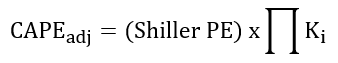
The most important thing is to get the best representation of CAPE such that all earnings years in the denominator reflect the conditions of the present. Doing that, we can stack as many adjustments as we’d like1:
For instance, the Tax Cuts and Jobs Act was passed in 2018. This lowered the corporate tax rates substantially. Corporations saw an immediate windfall with a portion of taxes effectively turning into earnings overnight. Using the legacy Shiller PE, nothing happened in 2018, and those effects only trickled in as more time passed and more historic years peeled off the the metric. See my previous CAPE adjustment post.
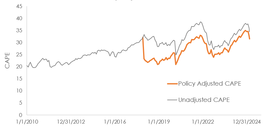
But this also means that by the end of 2021, when the Shiller PE was approaching 40x, there were structural effects that made that number unrepresentative - Tax Cuts and Jobs Act not being fully baked in + Liquidity spike.
If we think that these changes are here to stay, and that they offer meaningful impacts on earnings, then it makes sense to try to account for those.
Here is the full adjustment for CAPE at the end of the year in 2021:
Shiller PE: 37x
TCJA factor: ~0.87
Liquidity Factor: 0.70
2021 Adjusted CAPE: 22.5x (37 x 0.87 x 0.70)
Final Remarks
I know there’s been a lot of buzz about the liquidity impact on flows. “More money chasing fewer assets” does make sense for fixed supply assets like gold and housing (I suppose). But I don’t think it makes much sense for equity markets beyond short term mechanical / technical impacts. In late 2020, I think we could make the argument that the flood of capital pushed up equity prices. But that flood of capital also created and funded new ventures as well (remember all the SPACs?)…effectively growing the total pool of assets. In the long run, the boost to equity prices is a function more in the sustained earnings power that the permanent bump in liquidity provides. So just for the record, nothing in this article rests on the “more money chasing fewer assets” argument.
In terms of valuations today, no matter how you slice it, today’s cyclically adjusted measurements clock in somewhere in the upper 30s to low 40s. At this point, the “pig” of structural changes has made it pretty much all the way through the “python”.
But that also indicates that if things were actually pretty cheap in 2021 and 2022, then they’re definitely expensive now.
We may also be able to judge the impacts of future policy based on the findings from this study. If we forecast more money printing and liquidity injection into the markets (especially if those capital injections make it down to consumers), then we can project that influx to mechanically make valuations more attractive. If that’s our forecast, then you can certainly attempt to front run that. And perhaps that expectation has been pushing equities up since tariff day.
Also, the tariff impacts do still exist. We don’t know in what regard, really, but it does still make sense that those will impair earnings and valuations to some degree (even if small). I suppose that if most of the Mag7 is relatively insulated from tariffs, then maybe we can largely ignore those effects, however.
References
M2 Money Supply (going back a little further than FRED report)
Davisia M2 (Alternative Estimate of M2)
Shiller PE and S&P 500 Earnings Data
Special care is needed to ensure that factors are independent of one another. We shouldn’t adjust for CPI and then adjust for Money Supply because those indicators are likely comingled. Making both adjustments would probably overstate the true impact of them.
Interesting take on using M2 as the deflator instead of CPI. The relationship you showed between nominal earnings and money supply really does look tighter than earnings vs inflation, which makes intuitive sense when liquidity drives consumption regardless of price movements. What I find compelling is the 2021 adjusted valuation you calculated at 22.5x versus the legacy 37x, that gap is massive and shows how much structural policy influnce can distort traditional metrics. The challenge I see is forecasting future M2 trajectories for forward looking portfolio decisions, but for historical context this adjustment seems way more useful than just assuming CPI captures everything.